
در این قسمت به آموزش ساخت نمودار رادار میپردازیم :
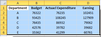
1. Select the data range you need to show in the chart. See screenshot:
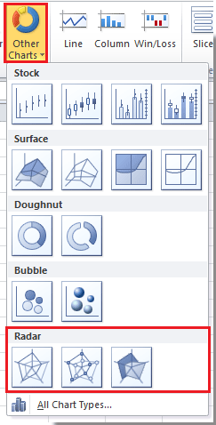
2. Click Insert > Other Charts > Radar, and select the radar chart type you like, here I select Radar with Markers. See screenshot:
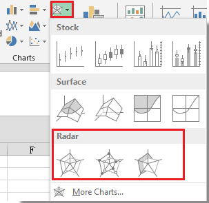
Tip: In Excel 2013, click Insert > Insert Stock, Surface or Radar Chart > Radar. See screenshot:
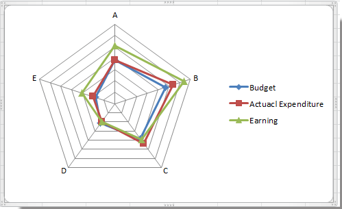
Now the radar chart is created with the axis labels.
If you just want to view the benefit or stability of the each department, you can delete the axis labels for clearly viewing.
3. Right click at the axis, and select Format Axis from the context menu. See screenshot:
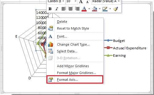
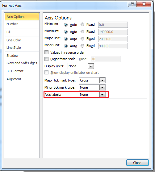
4. In the Format Axis dialog, select None in Axis labels drop down list, and close this dialog. See screenshot:
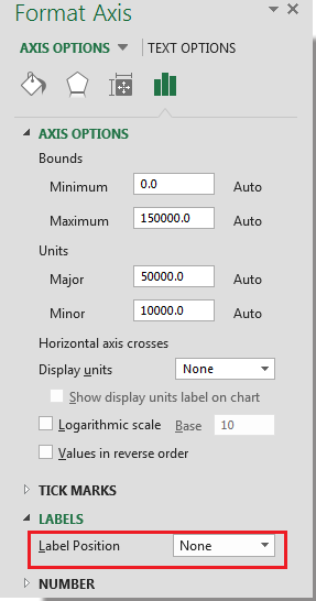
Tip: In Excel 2013, click on LABELS to expand its option in the Format Axis pane, then select None in the Label Position list. See screenshot:
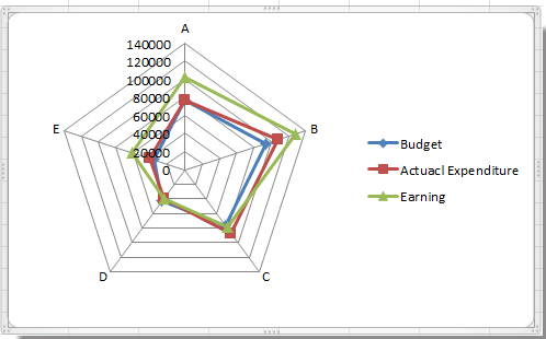
Now you can see the radar chart as show below:


 اعداد در اکسل")

")


